Creating professional marketing assets with free tools
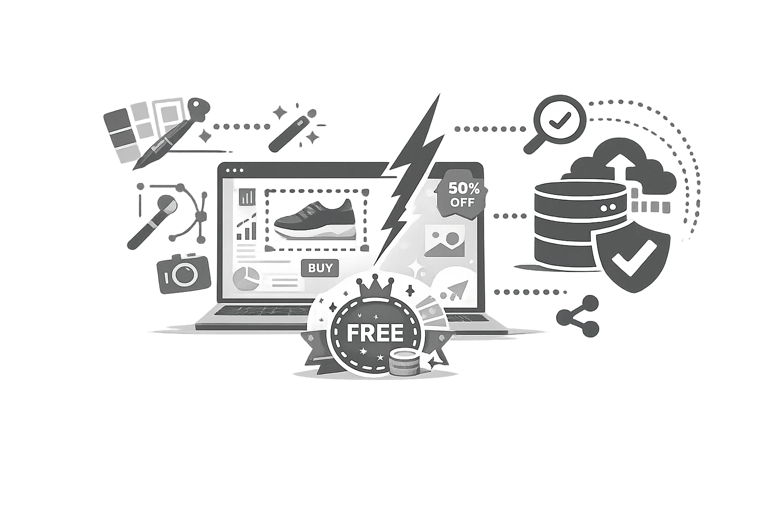
How to create professional marketing assets for free?
Most small businesses do not have a designer on standby. Solopreneurs, consultants, early-stage founders, and lean agencies still need polished visuals, but they often lack the budget, time, or software stack to build everything from scratch.
That creates a familiar problem: the business needs to look credible before it can afford a full brand system.
The good news is that in 2026, many visual tasks do not require advanced design skills. With the right workflow and a few lightweight utilities, you can create marketing assets for free, stay visually consistent, and produce professional marketing assets that are good enough to ship.
This guide is for teams that need results, not design theory.
The solopreneur and lean agency dilemma
Small teams face three constraints at once:
- limited time
- limited budget
- limited creative bandwidth
Yet they still need:
- a recognisable colour system
- web-ready images
- a favicon
- social graphics in the right dimensions
- polished branded consistency across touchpoints
The alternative is usually one of two extremes:
- pay for enterprise design tools you barely use
- publish mismatched visuals that weaken trust
Neither is ideal.
A simpler approach is to separate “brand decisions” from “heavy design production.” Many marketing assets are really about formatting and consistency, not illustration.
What makes a marketing asset look professional?
A professional asset need not be complex. It needs to be consistent.
The five signals that make assets look credible
- Consistent color usage
- Correct sizing for each platform
- Clean spacing and readability
- Sharp exports without distortion
- Matching small details like favicon and brand accents
That means the fastest way to win is not by learning advanced design. It is setting up a simple visual system.
Step 1: Generate a brand identity instantly
A brand identity does not need a 40-page guideline deck to be useful. For small teams, the first version can be lightweight.
Start with colour consistency.
Colour is one of the quickest ways to make assets feel intentional. If you already have a logo, product screenshot, hero image, or website visual, you can extract usable colours from it.
A tool like CampaignMorph Colour Palette Extractor helps turn an existing image into a working brand palette. That is valuable because it removes the guesswork from questions like:
- Which blue should we use for buttons?
- What accent colour pairs with our logo?
- Which neutral background actually matches our site?
Build a simple mini-style system.
Choose:
- 1 primary colour
- 1 secondary colour
- 1 accent color
- 1 dark neutral
- 1 light neutral
That is enough for:
- web graphics
- slide covers
- checklists
- social templates
- PDF headers
Simple palette table
| Role | Example use |
|---|---|
| Primary | Buttons, titles, links |
| Secondary | Subheads, section backgrounds |
| Accent | Highlights, callouts, badges |
| Dark neutral | Body text, footers |
| Light neutral | Backgrounds, cards, whitespace blocks |
Step 2: Make the small brand details match
One overlooked sign of an amateur brand is inconsistency in the tiny interface elements.
Why does the favicon matter?
A favicon is small, but it appears in:
- browser tabs
- bookmarks
- search previews in some contexts
- app shortcuts
- saved links
If the site still shows a generic default icon, it subtly reduces credibility.
A tool like CampaignMorph Favicon Creator helps small teams create the necessary favicon formats without design software. That is an easy win during website setup or refreshes.
Other high-trust small details
- consistent file naming for assets
- matching social profile icons
- standardised image ratios
- clean thumbnails for blog posts
Professionalism is often the sum of minor consistencies.
Step 3: Format images without heavy software
This is where many non-designers get stuck. They do not need to “design” the image—they need it in the right shape, size, and file weight.
Common image tasks every marketer faces
- Resize a blog header
- Make a square social image
- Prepare a wide hero banner
- Create email-compatible graphics
- Reduce file size for faster pages
A tool like CampaignMorph Image Resizer helps solve the sizing problem quickly, without needing Photoshop or a complex editor.
Why does this matter for marketing results?
The HTTP Archive has consistently shown that images account for a large portion of webpage weight. And Google’s page speed research has linked slower-loading pages to a higher risk of bounce. So image formatting is not just a design task. It is a performance and conversion task.
If your hero images are oversized or poorly cropped, you hurt both visual polish and user experience.
A practical no-designer workflow
Here is a simple workflow anyone can use.
Step-by-step process
- Choose a source visual. Use your logo, website hero, or product screenshot.
- Extract a colour palette. Use CampaignMorph Colour Palette Extractor to create a consistent set of brand colours.
- Define asset templates. Decide on three default formats: blog, image, social post image, email, or PDF banner
- Resize visuals for channel needs. Use the CampaignMorph Image Resizer to ensure correct dimensions.
- Create favicon assets. Use CampaignMorph Favicon Creator to cover site and browser needs.
- Save a basic brand reference sheetbrbr --- Unknown node: hardBreak ---
Include colours, dimensions, icon files, and usage notes.
This workflow can be completed in under an hour and provides a repeatable visual baseline.
Tactical Asset Examples for Non-Designers
Example 1: Founder launching a newsletter
You need:
- a header image
- an avatar background color
- a website favicon
- a LinkedIn post template
Use a brand screenshot to extract a palette, create favicon files, then resize one hero visual into multiple formats.
Example 2: Lean agency onboarding a client
You need:
- a quick visual mood direction
- proposal cover styling
- blog thumbnails
- landing page favicon
Use the client’s existing homepage or logo to extract colours, create standard dimensions, and build a lightweight asset kit before any custom design work begins.
Example 3: E-commerce side project
You need:
- product banners
- resized collection images
- mobile-friendly featured visuals
- consistent tab branding
Again, this is mostly formatting and consistency, not advanced graphic design.
What to standardise first?
If you want better visual output fast, standardise these before anything else:
Dimensions
- Blog header: one standard size
- LinkedIn image: one standard size
- Instagram square: one standard size
- Email banner: one standard size
Colors
Keep a small approved set.
File names
Use simple conventions such as:
- brand-blog-header-01
- brand-linkedin-tip-01
- brand-email-banner-01
Asset folder structure
- /logos
- /favicons
- /social
- /blog
These details make a solo operation look far more mature.
Free tools vs. Full design platforms
| Need | Free/lightweight tool approach | Full design platform |
|---|---|---|
| Quick image resize | Ideal | Often overkill |
| Palette extraction | Ideal | Not necessary |
| Favicon creation | Ideal | Not necessary |
| Complex illustration | Limited | Better fit |
| Team design systems | Limited | Better fit |
| Daily non-designer production | Excellent | Can be slower |
This is why marketing tools with no design skills are so useful. They solve 80% of visual operations work, that is, about execution, not artistry.
Mistakes non-designers should avoid
1. Using too many colours
A brand with seven competing accents looks unstructured.
2. Stretching images
Distorted visuals instantly reduce perceived quality.
3. Ignoring favicon and thumbnail details
Small elements shape first impressions.
4. Uploading giant images
Heavy files slow pages and hurt UX.
5. Changing sizes every time
Inconsistency creates more work and weaker output.
Conclusion
You do not need to become a designer to publish credible, consistent visuals. What you need is a lightweight system that handles the essentials: colour, sizing, and small brand assets.
That is why marketing tools with no design skills are so valuable for small businesses and lean teams. They let you create marketing assets for free, stay consistent, and ship faster without heavyweight software. Start by extracting a palette with CampaignMorph Colour Palette Extractor, generating your site icon with Favicon Creator, and standardising visual output across channels with Image Resizer.
If your business looks more consistent this week than it did last week, you are already making progress toward more professional marketing assets.
Sources
- HTTP Archive, Web Almanack findings on image weight and web performance
- Google/Think with Google, mobile speed and bounce research
- Nielsen Norman Group, usability and visual clarity guidance
- HubSpot, branding and content presentation trends for marketers
- General best practices from modern web UX and brand consistency frameworks