CSS Gradients Complete Beginner Guide
In the early days of the web, if you wanted a gradient background, you had to design a thin image slice in Photoshop and repeat it across the page. It was slow and inflexible, increasing page load times.
Today, CSS gradients are a fundamental design element. They are generated by the browser itself, meaning they require no image files, scale infinitely to any screen size without pixelation, and can be edited instantly with code. From subtle button hovers to vibrant, modern hero backgrounds, mastering CSS gradients is essential for any digital marketer or web designer.
What Is a CSS Gradient?
In CSS, a gradient is technically treated as an image type (<image>), but it is created using a function. You define it within the background or background-image property.
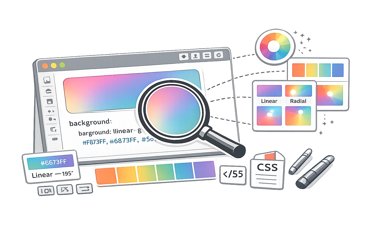
A gradient creates a smooth transition between two or more colours. There are three main types you can create: Linear (straight lines), Radial (circular/outward), and Conic (rotated around a centre).
Linear Gradients - The Most Common Type
Linear gradients transition colours along a straight line. This is the standard "top to bottom" or "left to right" fade.
Basic Syntax:background: linear-gradient(direction, color1, color2);
Examples:
1. Top to Bottom (Default):
background: linear-gradient(#ff6b6b, #feca57);
This creates a sunset effect, fading from red to yellow downwards.
2. Left to Right:
background: linear-gradient(to right, #4F46E5, #9333EA);
A modern tech gradient fades from indigo to purple across the screen.
3. Diagonal (45 Degrees):
background: linear-gradient(45deg, #11998e, #38ef7d);
A dynamic angle is often used for buttons or hero sections.
4. Hard Stops (Stripes):
background: linear-gradient(to right, red 50%, blue 50%);
Instead of a fade, this creates a sharp line: left half red, right half Blue. This happens because both colours "meet" exactly at the 50% mark.
Radial Gradients
Radial gradients start from a central point and radiate outwards, like a spotlight or a sun.
Basic Syntax:background: radial-gradient(shape at position, color1, color2);
Example: Spotlight Effect
background: radial-gradient(circle, #ffffff, #000000);
A white centre fading to black edges, looking like a light shining in the dark.
Conic Gradients
Conic gradients are rotated around a centre point, like the hands of a clock sweeping around. They are great for creating pie charts or colour wheels in pure CSS.
Example: Colour Wheel
background: conic-gradient(red, yellow, green, blue, red);
CSS Gradient Tricks Every Designer Should Know
1. Transparent Gradient Over Images
Often, text is hard to read over a photo. Add a subtle black gradient overlay using rgba (Red, Green, Blue, Alpha) to darken just the bottom of the image.
background: linear-gradient(to bottom, rgba(0,0,0,0), rgba(0,0,0,0.7)), url('image.jpg');
2. Gradient Text Effect
You can clip a gradient to the text itself for a cool modern effect (WebKit browsers only).
background: linear-gradient(to right, #30CFD0 0%, #330867 100%);
-webkit-background-clip: text;
-webkit-text-fill-color: transparent;
3. Subtle UI Depth
Use a very subtle vertical gradient (e.g., white to off-white) on buttons or cards to give them a tactile, 3D feel without heavy drop shadows.
Using the CampaignMorph CSS Gradient Generator
Writing gradient code by hand is tricky—it's hard to visualise the angles and hex codes. It is much easier to use a visual tool.
Using the CSS Gradient Generator, you can:
- Pick your colours using a visual picker.
- Drag a slider to rotate the angle (e.g., 135deg).
- Add multiple colour stops for complex effects.
- See the result instantly in the preview box.
- Copy the finished CSS code with one click.
Design beautiful gradients instantly
Visually build linear and radial gradients and get the CSS code.
Gradients and Brand Identity
Gradients are an excellent way to extend your brand palette. If you have a primary Blue and a secondary Green, a gradient blending the two creates a unique "Brand Texture" you can use for social media backgrounds, slide decks, and website headers.
Frequently Asked Questions
1. Are CSS gradients supported in all browsers?
Yes, all modern browsers (Chrome, Firefox, Safari, Edge) fully support linear and radial gradients. Conic gradients are also widely supported in modern versions. For very old browsers (like IE9), you would need a fallback solid background colour.
2. Is it better to use CSS gradients or gradient images?
CSS gradients are superior. They require no HTTP request (faster load times), scale infinitely without blur, and take up virtually no file space. Only use image gradients if you need a specific artistic texture (like noise or grain) that CSS cannot easily do.
3. How do I create a gradient text effect in CSS?
You use background-clip: text. First, set the gradient as the background. Then set -webkit-background-clip: text. Finally, set the text colour transparent so the background shows through the letter shapes.
4. Can I use gradients for CSS borders?
Yes, but it is tricky. The standard border-color doesn't support gradients. You typically use border-image or a wrapper div with padding and a gradient background to simulate a border.
5. What is a hard colour stop in CSS?
Normally, gradients fade. A "hard stop" creates a sharp line. You achieve this by setting two colours at the exact same location percentage (e.g., Red at 50%, Blue at 50%).
6. How do I make a 45-degree diagonal gradient?
Use 45deg as the first parameter in your linear-gradient function: linear-gradient(45deg, blue, red).
Gradients add depth, polish, and modern flair to any design. CSS is a lightweight and powerful tool in your kit.