Colour Theory 101 for Marketers
Colour is the silent salesperson. Before a customer reads a single word of your copy, before they register your headline or your offer, their brain has already processed the colour of your visual and formed an emotion. That process takes approximately 90 milliseconds.
Research consistently shows that up to 90% of snap judgements about products are based on colour alone, and that colour can increase brand recognition by up to 80%. Yet most marketers choose colours based on personal preference, or worse, "what looks nice." Colour theory provides a rational, evidence-based framework for making visual decisions that actually move people to act.
You don't need an art degree to use it. This guide will equip you with the fundamentals—everything a marketer needs, nothing they don't.
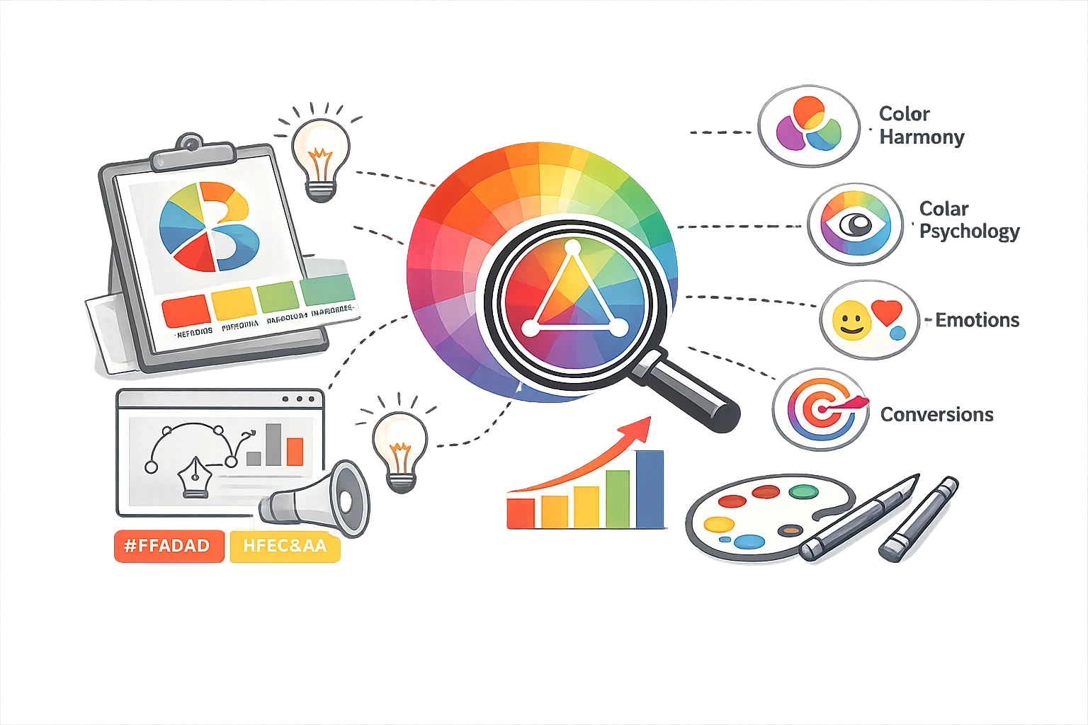
The Colour Wheel: Understanding the Basics
The colour wheel is the foundational map of colour relationships. All of colour theory flows from it.
- Primary Colours: Red, Yellow, Blue (in traditional pigment theory). In screen/light theory (relevant for digital marketing), the primaries are Red, Green, Blue (RGB). Not sure which format to use for your brand? Check our Hex vs RGB vs HSL Guide.
- Secondary Colours: Colours formed by mixing two primaries - Orange (Red + Yellow), Green (Blue + Yellow), Purple (Red + Blue).
- Tertiary Colours: The in-between shades - Yellow-Orange, Red-Orange, Red-Purple, Blue-Purple, Blue-Green, Yellow-Green.
Warm Colours (Reds, Oranges, Yellows) sit on one half of the wheel. They create feelings of energy, warmth, urgency, and appetite. Cool Colours (Blues, Greens, Purples) sit on the other half. They create feelings of calm, trust, logic, and cool detachment.
The 6 Colour Harmony Rules
Colour harmony is the practice of choosing colours that work well together. There are six core rules:
1. Complementary Colours
Complementary colours sit directly opposite each other on the colour wheel (e.g., Blue and Orange, Red and Green, Purple and Yellow). They create maximum contrast and visual tension.
In Marketing: Ideal for high-energy, attention-grabbing designs. Sports brands, fast food, and sales promotions often use complementary schemes. Think of the New York Knicks' blue and orange, or Fanta's orange on blue.
2. Analogous Colours
Analogous colours are three colours sitting side by side on the wheel (e.g., Blue, Blue-Green, Green). They are harmonious, calming, and pleasing to the eye; there's no visual conflict.
In Marketing: Perfect for wellness, nature, or lifestyle brands that want to feel cohesive and serene. Think Starbucks' use of greens. The risk is that they can feel low-energy if there's no contrast element.
3. Triadic Colours
A triadic scheme uses three colours evenly spaced around the wheel (e.g., Red, Yellow, Blue, or Orange, Green, Purple). It creates a vibrant, playful balance.
In Marketing: Children's brands, creative agencies, and entertainment companies use triadic palettes. They feel fun and energetic without the harsh tension of complementary pairs.
4. Split-Complementary Colours
Instead of using the exact complement of a colour, you take the two colours adjacent to the complement. For example, instead of Blue + Orange, you use Blue + Yellow-Orange + Red-Orange.
In Marketing: A safer version of the complementary scheme. It provides a strong visual contrast without the aggressive tension. Good for businesses that want to stand out without shouting.
5. Tetradic (Square) Colours
Four colours forming a square or rectangle on the colour wheel - two complementary pairs. This scheme is rich and complex.
In Marketing: Can work beautifully but requires care. One colour must dominate, or the design feels chaotic. Best left for experienced designers or very controlled brand applications.
6. Monochromatic Colours
A monochromatic scheme uses one hue at varying levels of saturation and lightness. For example, a deep navy, a mid-blue, a sky blue, and a near-white, all derived from the same blue hue.
In Marketing: Extremely clean, sophisticated, and easy to execute. It creates a strong visual identity and high brand recognition. Many premium SaaS and fintech brands use monochromatic schemes precisely because they feel polished and professional. You can easily create these by using a Colour Palette Extractor on a single high-quality brand image.
Colour Temperature and Emotion
Beyond harmony rules, the overall "temperature" of your palette sends a message before any individual colour is identified.
- Warm Palettes (Red, Orange, Yellow): Trigger a sense of urgency, appetite, energy, and excitement. Excellent for food and beverage, retail sales, fitness, and entertainment. The human eye is drawn to warm colours first - which is why "Buy Now" buttons are often red or orange.
- Cool Palettes (Blue, Green, Purple): Trigger calm, trust, intelligence, and health. Essential for finance, tech, healthcare, insurance, and professional services. These colours make people feel safe leaving their data with you.
Saturation and Brightness in Marketing
The "mood" of a colour is as much about its purity and brightness as its hue.
- High Saturation (Vivid colours): Feel bold, youthful, urgent, and playful. Used by children's brands, discount retailers, and social platforms targeting younger demographics.
- Low Saturation (Muted, desaturated colours): Feel sophisticated, premium, calm, and mature. Used by luxury brands, wellness products, and editorial media.
- High Brightness (Light tones): Approachable, friendly, fresh. Used by new startups and consumer apps.
- Low Brightness (Dark tones): Premium, serious, exclusive. Used by luxury watches, prestige cars, and high-end food and drink.
Contrast and Accessibility in Marketing
No matter how beautiful your palette is, if people can't read your content, it fails. Contrast is not just a design nicety — in many markets, it is a legal accessibility requirement.
The WCAG 2.1 AA standard (Web Content Accessibility Guidelines) requires:
- A minimum contrast ratio of 4.5:1 for normal body text.
- A minimum contrast ratio of 3:1 for large text (18pt+ or 14pt bold).
Two quick practical tests: The Squint Test — squint your eyes until your design blurs. If the text and background blend together, the contrast is too low. The Greyscale Test convert your design to greyscale. Can you still read it clearly? If yes, your contrast works. If not, adjust.
Colour in Calls-to-Action and Conversion
Few topics in marketing generate more debate than "what colour should my CTA button be?" Dozens of case studies claim that red outperforms green or that orange outperforms blue. The truth is more nuanced.
The most important principle is contrast, not hue. Your CTA button simply needs to stand out visually from its surrounding background. On a predominantly blue page, an orange button stands out. On a white page, a deep green button stands out. The specific colour is secondary — what matters is that it commands attention.
The secondary principle is temperature and urgency. For time-limited offers and checkout buttons, warm colours (red, orange) can create subtle urgency. For trust-based actions (e.g., "Book a Consultation," "Sign Up Free"), cool or neutral colours feel less pressuring.
Cultural Colour Considerations
Colour meaning is not universal. If you operate globally, be aware of cultural differences:
- White: Purity in Western cultures, but associated with mourning in China, Japan, and parts of South Asia.
- Red: Danger and urgency in the West; luck, prosperity, and celebration in China and India.
- Green: Has significant religious meaning in Islamic contexts (used prominently in flags). Exercise care when using green in Middle Eastern marketing.
- Purple: Royalty in Western contexts; mourning in parts of Brazil and Thailand.
Major global brands often adapt their colour usage by market. What resonates in one culture can actively offend in another.
Ready to apply colour theory to your brand?
Convert, extract, and refine your colours with free browser tools.
Frequently Asked Questions
1. What is the most effective colour for a call-to-action button?
There is no single "best" CTA colour. The most effective colour is the one that provides the highest contrast against the page background while fitting the brand's tone. Orange and red are common choices because they contrast well against blue and white page designs.
2. Does colour really affect purchasing decisions?
Yes, substantially. Research consistently shows that colour is the first sensory input processed when viewing a product or website, and that it influences perceived value, trust, and urgency. Up to 85% of purchasing decisions are influenced by colour.
3. What colour combinations should I avoid?
Avoid: Red text on a blue background (vibrates and causes eye strain). Pure Yellow text on white (near-invisible). Very similar hues with low contrast (looks accidental). Neon colours for body text (impossible to read for extended periods). These combinations actively harm readability and user experience.
4. What is a monochromatic colour scheme?
A monochromatic scheme uses a single hue (colour) but varies its saturation (purity) and lightness (how light or dark it is). For example, a palette of navy, mid-blue, light blue, and near-white is monochromatic. It feels clean, cohesive, and professional.
5. How do I check if my colour contrast is accessible?
Use a free online contrast checker (search "WCAG contrast checker"). Enter your text colour and background colour, and the tool tells you whether you meet the AA or AAA standard. Many browser developer tools also have this built into the accessibility inspector.
6. What is the difference between hue, saturation, and brightness?
Hue is the "name" of the colour Red, Blue, Green. Saturation is how vivid or grey it is. 100% is pure colour, 0% is completely grey. Brightness/Lightness is how light or dark it is — 100% is white, 0% is black. Together, these three properties completely describe any colour.
Colour theory is not a creative luxury; it is a strategic toolkit. Whether you are designing a landing page, choosing packaging, or picking a button colour, applying these principles will result in more effective, more compelling, and more accessible marketing. For visualising complex brand workflows, try our Mermaid Diagram Generator to map out your customer journey.
Explore related guides: Brand Visual Identity Guide and How to Choose Brand Colours. Ready to put theory into practice? Use the Colour Palette Extractor to build your first harmonious palette.