How to Create Custom Interactive Maps for Presentations and Marketing
Why do custom maps matter?
Maps are one of the most immediately understood visual formats. A coloured world map showing where your customers are, a state-level map highlighting sales territories, or a pin-dropped map of event locations communicates geographic data faster than any table or paragraph ever could.
But creating these maps has traditionally required either expensive GIS software like ArcGIS or QGIS, advanced design skills in tools like Adobe Illustrator, or embeddable map services that charge per view. For a marketer who needs a clean, branded map for a quarterly presentation or a blog infographic, these options are overkill.
That gap is exactly what a browser-based interactive map builder fills.
What does the Interactive Map Builder do?
The CampaignMorph Interactive Map Builder is a free, client-side tool that lets you create custom maps without installing software or uploading data to external servers. Everything runs in your browser.
Core features
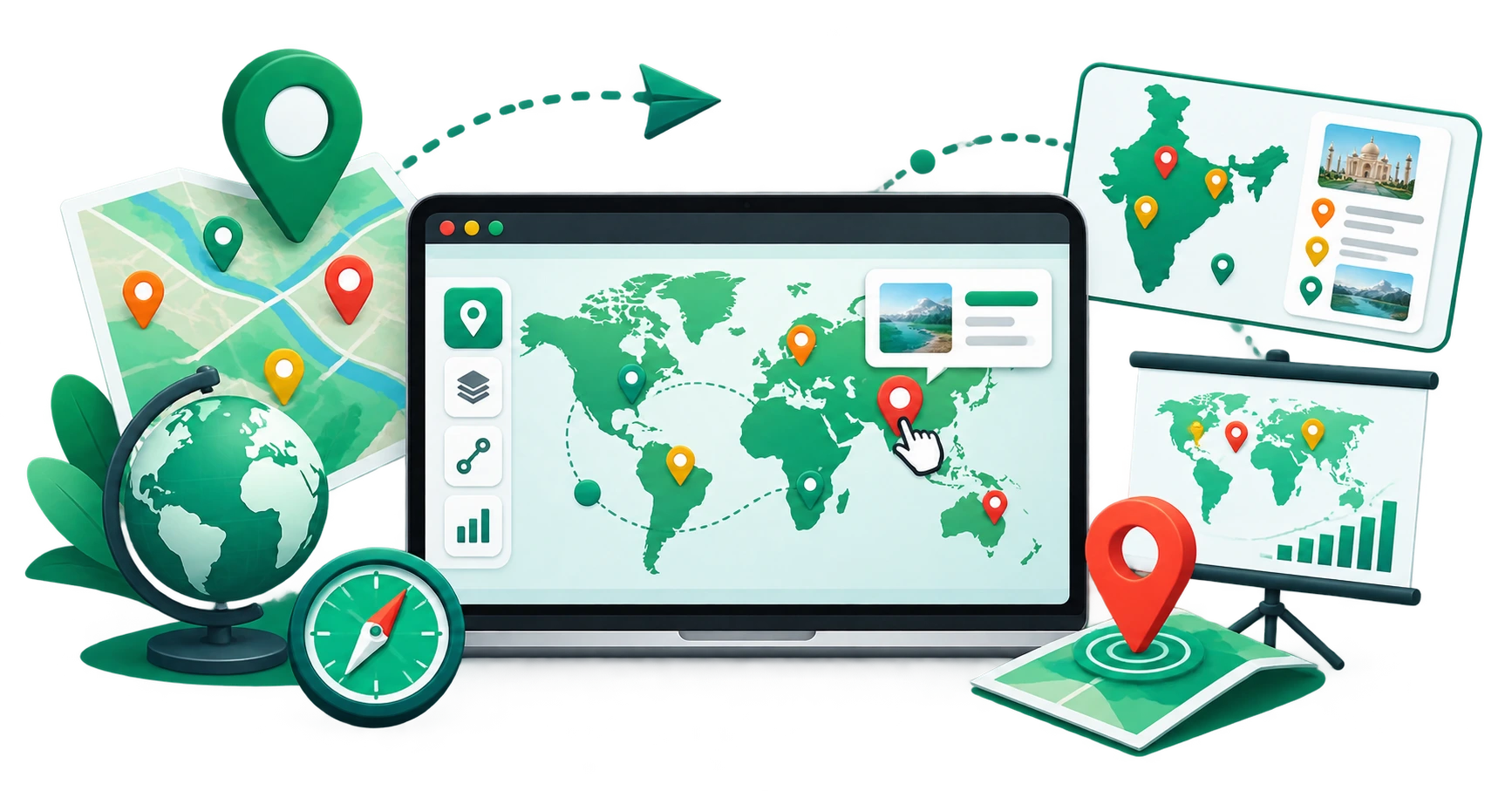
- World map and US state map: choose between a global view with country-level regions or a United States map with state-level regions
- Region colouring: click any country or state to apply a colour, creating choropleth-style maps that show categories, performance levels, or any regional distinction
- Custom pins: drop location markers at any point on the map with custom labels, colours, and sizes
- Design customisation: adjust base colours, border styles, background colour, and fonts to match your brand
- Three export formats: download as high-resolution PNG (for presentations and social media), scalable SVG (for print and further editing), or PDF (for documents)
What makes it different from Google Maps?
Google Maps is designed for navigation and real-time location data. The Interactive Map Builder is designed for visual communication. You are not embedding a live map with scrolling and zooming; you are creating a static, designed visual asset that you fully control. No API keys, no per-view costs, no third-party branding.
How to create a custom map: step by step
Step 1: Choose your base map
Select either the World map or the United States map. The World map includes country-level boundaries. The US map includes state-level boundaries.
Step 2: Colour regions
Switch to the Map tab and click on any region (country or state) to colour it. Each click applies a colour to that region. You can use different colours to represent different categories, for example, blue for existing markets, green for expansion targets, and grey for regions not covered.
This creates what cartographers call a choropleth map, a thematic map where regions are shaded in proportion to a variable. Choropleth maps are one of the most effective ways to present geographic data in business contexts.
Step 3: Add pins
Switch to the Pins tab, then click anywhere on the map to drop a pin. Each pin can have a custom label (e.g., "London Office," "Event Venue," "Distribution Centre"), a custom colour, and an adjustable size.
Pins are useful for:
- Marking office or store locations
- Highlighting event venues
- Showing supply chain nodes
- Indicating points of interest in editorial content
Step 4: Customise the design
Adjust the visual properties to match your brand:
- Base colour: the default colour of uncoloured regions
- Border colour and width: how region boundaries appear
- Background
a solid colour or transparent background - Pin styles: adjust marker colours and sizes
Step 5: Export
Download your finished map in the format that fits your use case:
- PNG: high-resolution raster image, ideal for PowerPoint, Google Slides, social media posts, and blog articles
- SVG: vector format, infinitely scalable without quality loss, ideal for print materials, posters, and further editing in design tools like Figma or Illustrator
- PDF: formatted for document embedding and professional printing
Use cases
Sales territory maps
Visualise which regions each sales representative covers. Colour code by rep, by revenue tier, or by growth potential. Export the map and include it in quarterly business reviews.
Market expansion presentations
Show investors or leadership where you currently operate and where you plan to expand. A coloured world map with a clear legend communicates global strategy at a glance.
Travel and editorial content
Travel bloggers and editorial teams use custom maps to show the locations mentioned in an article. A map with pins marking "10 Best Restaurants in Tokyo" or "Our European Road Trip Route" adds visual context that text alone cannot provide.
Event promotion
If you are hosting an event with multiple venues, a pin-dropped map helps attendees understand the geography. Export the map and include it on the event website, in email invitations, or in printed programmes.
Infographics and reports
Combine the exported map with other data visualisations. Use the Chart Generator to create bar charts, line graphs, or pie charts, and combine them with your map to build complete data-driven infographics.
Education
Teachers use thematic maps to teach geography, economics, and social studies. A map showing GDP by country, climate zones, or historical territories is a standard classroom resource. The tool's export options make it easy to create handouts.
Optimising exported maps for the web
If you plan to use the exported map on a website or in a blog post:
- Use PNG for quick embedding. It is universally supported and renders consistently across all browsers.
- Use SVG for responsive layouts. SVG maps scale perfectly to any screen size without pixelation.
- Compress before uploading. Run the exported PNG through the Image Compressor to reduce file size without visible quality loss. Smaller images improve page load times and Core Web Vitals scores.
- Resize if needed. If the exported PNG is larger than your layout requires, use the Image Resizer to scale it to the exact dimensions you need.
Frequently asked questions
1. Is the Interactive Map Builder free?
Yes. The tool is completely free to use with no watermarks, no sign-up, and no usage limits.
2. Is my data uploaded to a server?
No. All map rendering, styling, and processing happens directly in your web browser. No data is sent to or stored on any external server.
3. Can I use the exported maps commercially?
Yes. The maps you create can be used freely for both personal and commercial purposes, including presentations, publications, websites, and printed materials.
4. What map projections are available?
The World map uses a standard projection suitable for thematic visualisation. The US map uses an Albers equal-area projection, which is the standard for US state-level cartographic display.
5. Can I add custom text labels?
Yes. Pins support custom text labels. You can also add text overlays and annotations using the Map Controls panel.
6. What if I need a map of a specific country or continent?
The current version supports World and United States base maps. For other regions, you can colour only the relevant countries on the World map and set the rest to a neutral colour.
Try the free Interactive Map Builder
The CampaignMorph Interactive Map Builder lets you create professional custom maps in minutes. Colour regions, add pins, customise the design, and export as PNG, SVG, or PDF. No GIS software, no design skills, no sign-up required.
For related visual tools, explore the Chart Generator, Screenshot Beautifier, and Image Compressor.
Sources
- Choropleth map design best practices: standard cartographic conventions documented across academic and professional cartography resources
- Google Search Central: guidance on image optimisation and page performance for web-published visual content
Share this article
Help other marketers, developers, and creators discover these insights.