How to Create Animated CSS Shapes: Morphing Blobs, Masks and Section Dividers
What are animated CSS shapes?
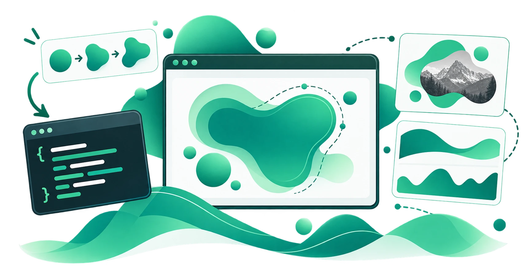
Animated CSS shapes are elements whose visible outline changes continuously over time, creating a morphing or flowing effect. The most common examples are:
- Morphing blobs: organic shapes that smoothly transition between different random variations, used as hero section backgrounds
- Animated wave dividers: wavy section separators that undulate, creating a fluid feel between content blocks
- Shape-masked images: photographs clipped into a blob or organic shape that slowly morphs, drawing subtle attention to the image
These animations are achieved using CSS @keyframes that transition between multiple clip-path or SVG path states. The browser interpolates between each keyframe, producing smooth shape changes.
The visual effect is striking; it makes a page feel alive and dynamic, but writing the CSS by hand is exceptionally tedious. A morphing blob requires defining 5–10 distinct path variations, each with the same number of control points, and chaining them into a multi-step keyframe animation. This can easily exceed 100 lines of CSS for a single animated shape.
What does the CSS Shape Animator do?
The CampaignMorph CSS Shape Animator generates these animations automatically. You choose a shape, adjust the visual parameters, and the tool produces complete @keyframes CSS ready to paste into your project.
Three modes
The tool supports three primary use cases, each with its own output format:
1. Image mask mode
Upload an image and apply a morphing shape as a mask. The image is clipped into a blob, wave, or organic shape that continuously morphs. This is commonly used for:
- Profile photos that feel more dynamic than static circles
- Product images with a distinctive, branded frame
- Hero images that catch attention without competing with the content
The tool lets you adjust the image position and zoom within the mask, so you can frame the subject exactly as needed.
2. Section divider mode
Generate an animated wave that functions as a section divider between two content blocks. The wave undulates smoothly, creating a fluid transition between sections with different background colours.
In this mode, the tool automatically switches to wave shapes and adjusts the output dimensions to be wider than tall, matching typical full-width divider proportions.
3. Background mode
Generate a morphing blob or shape as a standalone animated background element. This produces an SVG element with embedded animation that can be placed behind content as a decorative accent.
Customisation controls
- Shape type: blob or wave
- Complexity: number of control points (more points = more intricate shapes)
- Randomness: how far control points deviate from regularity
- Size: dimensions of the output shape
- Seed: randomise to get a completely different shape family
- Number of frames: how many distinct shape states the animation transitions through (more frames = smoother morphing)
- Animation duration: how long one complete morph cycle takes (in seconds)
- Easing: the timing function (ease-in-out for smooth organic motion, linear for constant speed)
- Colours: two-colour gradient applied to the shape background
Output
The tool generates:
- CSS
@keyframeswith multi-step percentage stops, each defining a differentclip-path: path()value - The corresponding element class with
animationproperty applied - For image mask mode: the complete CSS for the masked image container
You copy the CSS and apply it to your HTML element.
How CSS shape animation works
The keyframe approach
A morphing shape animation defines multiple distinct shape states at different percentage stops:
@keyframes morphShape {
  0% {
    clip-path: path("M 250,50 C 350,50 450,150 ...");
  }
  33% {
    clip-path: path("M 250,45 C 355,52 448,145 ...");
  }
  66% {
    clip-path: path("M 248,48 C 345,55 452,148 ...");
  }
  100% {
    clip-path: path("M 250,50 C 350,50 450,150 ...");
  }
}
The browser interpolates between each path state, producing a smooth transition. For this to work correctly, every path in every keyframe must have the same number and type of path commands. This is the primary technical constraint that makes hand-writing these animations difficult and the primary reason a generator is valuable.
Performance considerations
Shape animations are GPU-composited when using clip-path on elements with will-change: clip-path or when using SVG SMIL animations. This means they run at 60fps on modern hardware without blocking the main thread.
However, animating clip-path on very large elements (e.g., full-viewport backgrounds at 4K resolution) can consume GPU resources. For these cases:
- Keep the animation simple (3–5 keyframes rather than 10)
- Use
will-change: clip-pathto hint the browser - Prefer
transformanimations (scale, rotate) in combination with a static clip-path where possible
Common use cases
Hero section morphing backgrounds
The most popular use case: a large blob shape behind the hero heading and CTA that slowly morphs. This creates a sense of motion and modernity without distracting from the content.
Best practices:
- Use a low-opacity gradient fill so the text remains readable
- Set the animation duration to 6–10 seconds for subtle, calming motion
- Use
ease-in-outeasing for organic movement
Animated image frames
Clip a product photo, team headshot, or testimonial image into a morphing blob mask. The continuous subtle shape change draws the eye to the image more effectively than a static circle or square frame.
Combine this with the Image Resizer to prepare your images at the correct dimensions before masking.
Flowing section dividers
Replace static wavy SVG dividers with animated wave dividers. The wave undulates at the boundary between two sections, creating a fluid, modern feel. This works especially well between a coloured section and a white section.
Loading and transition states
Use morphing blob shapes as loading indicators or page transition effects. A smoothly morphing shape feels more polished and branded than a generic spinner.
CSS Shape Animator vs SVG Shape Generator
Both tools create shapes and animations, but they serve different purposes:
| Feature | CSS Shape Animator | SVG Shape Generator |
|---|---|---|
| Primary output | CSS keyframe animations | Static SVG code |
| Animation | Multi-frame morphing | Single-frame SMIL (optional) |
| Use case | Dynamic, moving shapes | Static decorative shapes |
| Image masking | Built-in support | Manual CSS integration needed |
| Section dividers | Dedicated mode | Manual positioning needed |
For static shapes, use the SVG Shape Generator. For animated shapes, use the CSS Shape Animator. For static CSS-only shapes without SVG, use the CSS Shape Generator.
Tips for effective shape animations
- Slow is better than fast. Animation durations of 4–10 seconds feel organic and calming. Durations under 2 seconds feel jittery and distracting.
- Loop seamlessly. The first and last keyframes should be identical so the animation loops without a visible jump. The generator handles this automatically.
- Use sparingly. One or two animated shapes per page is usually sufficient. Multiple competing animations reduce the impact of each one.
- Test on mobile. Some older mobile devices may struggle with complex path animations on large elements. Test on real devices and consider reducing complexity for mobile viewports.
- Respect
prefers-reduced-motion. Some users enable reduced motion settings for accessibility reasons. Wrap your animation in a media query:
@media (prefers-reduced-motion: reduce) {
  .morphing-blob {
    animation: none;
  }
}
Frequently asked questions
1. What is a CSS shape animator?
A CSS shape animator is a tool that generates @keyframes CSS code for morphing shape animations. It produces multiple shape states that the browser smoothly transitions between, creating a continuous morphing effect.
2. Do animated shapes affect page performance?
Minimally. CSS clip-path animations are GPU-composited in modern browsers and typically run at 60fps. For very large elements, keep the animation complexity low and use will-change: clip-path.
3. Can I use animated shapes as image masks?
Yes. The CSS Shape Animator has a dedicated image mask mode where you upload a photo and apply a morphing shape as a clip-path mask.
4. Is the CSS Shape Animator free?
Yes. The tool runs in your browser, requires no sign-up, and produces production-ready CSS with no watermarks or usage limits.
5. Will these animations work in all browsers?
clip-path: path() animation is supported in Chrome, Firefox, Edge, and Safari. For older browsers, the shape will appear static (the element displays without clipping), which is a graceful degradation.
Try the free CSS Shape Animator
The CampaignMorph CSS Shape Animator generates animated morphing shapes, image masks, and section dividers with complete CSS keyframe code. Choose your shape, adjust the animation, and copy the output. No coding required.
For related tools, explore the CSS Shape Generator, SVG Shape Generator, CSS Gradient Generator, and CSS Marquee Generator.
Sources
- W3C CSS Animations Level 1: specification for
@keyframesandanimationproperties - W3C CSS Masking Module Level 1: specification for
clip-pathandmaskproperties - MDN Web Docs: documentation for
clip-path,path(),@keyframes, andprefers-reduced-motion - Web Content Accessibility Guidelines (WCAG) 2.1 guidance on animation and motion for accessibility (Success Criterion 2.3.3)
Share this article
Help other marketers, developers, and creators discover these insights.