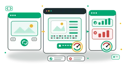
The Modern Web Asset Pipeline: How Frontend Developers Optimize Images, Vectors, & Shapes for Production
The High Cost of an Ad-Hoc Web Asset Workflow
In modern frontend development, media assets average over 50% of total page weight. While frameworks like Nuxt, Next.js, and Astro offer smart image components, they cannot fix fundamentally unoptimised upstream assets.
Every frontend engineer and JAMstack developer eventually faces the same friction:
- A designer delivers a 12MB raw PNG with a solid background that needs to be transparent.
- The product team wants an organic SVG wave divider between landing page sections.
- Mobile layout experiences jarring Cumulative Layout Shift (CLS) because image aspect ratios do not match CSS container dimensions.
- Lighthouse scores plummet because hero banners fail Largest Contentful Paint (LCP) budgets.
Jumping between Photoshop, Figma, command-line utilities, and sketchy cloud conversion sites that upload your company's proprietary assets is slow and risky.
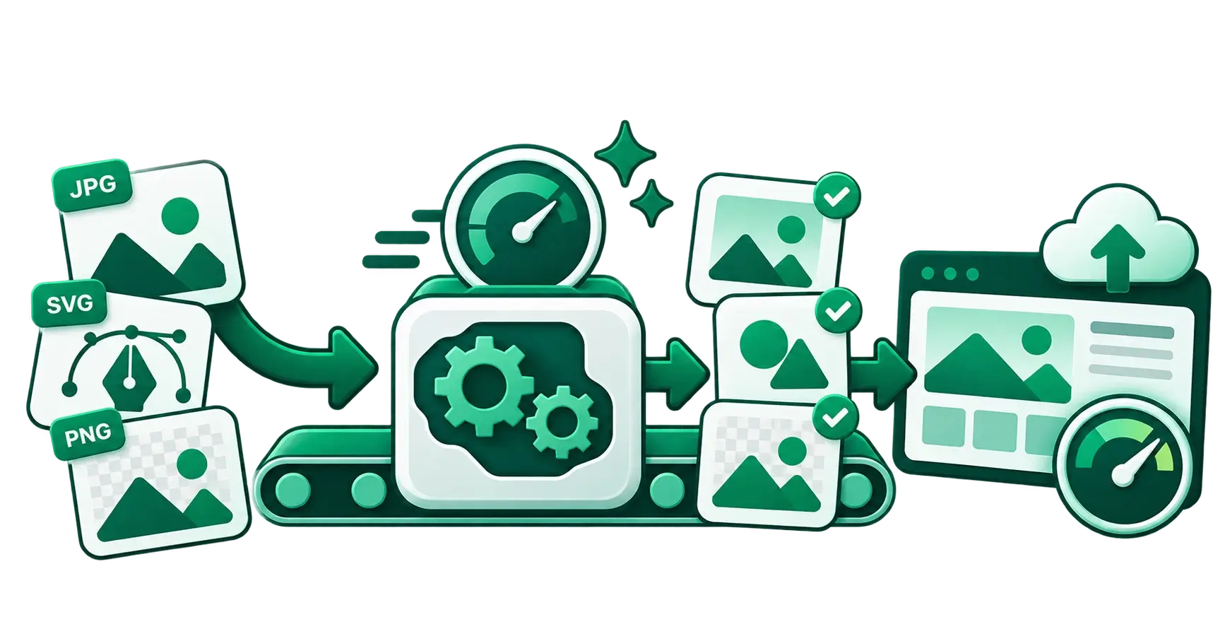
With a structured 5-stage web asset pipeline, you can turn raw visual files into production-ready web graphics in minutes, entirely in the browser, without server leaks.
The 5-Stage Modern Web Asset Pipeline
Raw Asset / Design Export
       │
       ▼
[ Stage 1: Dimension & Crop ] ────▶ Aspect Ratio Calculator & Image Cropper
       │
       ▼
[ Stage 2: Shape & Mask ]    ────▶ Background Remover, Image Mask Generator & SVG Shapes
       │
       ▼
[ Stage 3: Vector Tuning ]   ────▶ SVG Recolor & SVG to Component Converter
       │
       ▼
[ Stage 4: Format & Compress]────▶ WebP/AVIF Conversion & Lossless Compression
       │
       ▼
[ Stage 5: Production Polish ]───▶ Favicon Generator & Base64 Inlining
Stage 1: Dimensioning, Aspect Ratios & CLS Prevention
Before touching compression or colour spaces, you must define the physical geometry of your visuals.
Why Aspect Ratio Rigour Matters for Core Web Vitals
Cumulative Layout Shift (CLS) occurs when elements shift abruptly while assets load asynchronously. When a browser does not know an image's intrinsic width-to-height proportion before the file arrives over the network, it collapses the container to 0px and forces a reflow once the bytes arrive.
To solve this:
- Pre-calculate exact container proportions using the Aspect Ratio Calculator. Whether you need cinematic widescreen (
16:9), hero cards (4:3), or square avatar thumbnails (1:1), getting the exact pixel dimensions prevents sub-pixel rounding errors in CSS grid and flex layouts. - Crop out unnecessary whitespace and frame focal points tightly using the Image Cropper.
<!-- Prevent CLS by providing explicit dimensions and aspect-ratio styling -->
<img
  src="/hero-banner.webp"
  width="1200"
  height="675"
  style="aspect-ratio: 16 / 9; width: 100%; height: auto;"
  alt="Modern developer dashboard"
  loading="eager"
  fetchpriority="high"
/>
Developer Rule of Thumb: Never serve an image larger than 2x its maximum rendered CSS width on high-DPI displays. If your hero is capped at
600pxon desktop, the maximum asset width needed for retina screens is1200px.
Stage 2: Isolating Subjects, Organic Shapes & Cutout Masks
Standard rectangular visuals often make landing pages feel stiff and corporate. Modern web aesthetics emphasise organic curves, subtle geometric card frames, and clean isolated product screenshots.
Step A: Clean Cutouts with One-Click Background Removal
When preparing software UI mockups, creator headshots, or e-commerce inventory shots, you often need transparent alpha channels. Instead of manually painting layer masks in desktop software, run your visuals through the Background Remover. Because CampaignMorph processes your images locally in your browser, it never stores your proprietary screenshots or customer data on third-party cloud servers.
Step B: Non-Destructive Framing with Image Masks
If you want an avatar or feature preview framed as a smooth organic blob, hexagon, or circle:
- Use the Image Mask Generator to export transparent clipped PNGs with custom curves.
- For more background on styling custom shapes in modern CSS and standalone assets, explore our deep dive on using the image mask generator in 2026.
Step C: Dynamic Section Transitions with SVG Shapes
Instead of straight horizontal border lines between landing page sections, smooth waves and angled peaks create visual flow. Use the SVG Shape Generator to customise organic curves, wave dividers, and geometric polygon backdrops, then paste the raw vector paths directly into your templates:
<!-- Nuxt / Vue 3 Organic Section Divider -->
<template>
  <div class="relative bg-slate-950 text-white">
    <div class="max-w-7xl mx-auto py-24 px-6">
      <h2>Section Content</h2>
    </div>
    <!-- Seamless SVG Wave Divider Generated with CampaignMorph -->
    <div class="w-full overflow-hidden leading-none">
      <svg viewBox="0 0 1200 120" preserveAspectRatio="none" class="relative block w-full h-12 text-slate-900 fill-current">
        <path d="M0,0 C150,90 350,-40 500,60 C650,160 900,10 1200,40 L1200,120 L0,120 Z"></path>
      </svg>
    </div>
  </div>
</template>
Stage 3: Vector Tuning & Native Component Conversion
SVGs are the gold standard for icons, logos, and illustrations. Still, third-party vector files are frequently bloated with Figma/Illustrator metadata, hardcoded hex colours, and inline styles that clash with your CSS dark mode.
1. Palette Alignment via SVG Recolour
Before importing icons into your codebase, use SVG Recolour to replace arbitrary hex fills with your design system's CSS variable tokens (currentColor, var(--primary), etc.). This ensures your icons automatically adapt when switching between dark and light themes.
2. Zero-Runtime Component Generation
Past copy-pasting raw XML into HTML templates can lead to unreadable files. Convert raw SVGs into clean, tree-shakeable Vue or React components with the SVG to Component Converter. It strips unnecessary metadata tags (<metadata>, <defs>editor namespaces) while exposing standard props for width, height, and class.
Stage 4: Next-Gen Formatting & Performance Compression
This is where you lock in 90+ Lighthouse performance scores and guarantee rapid Largest Contentful Paint (LCP).
WebP vs AVIF vs Legacy Formats
| Format | Transparency? | Animation? | Compression vs JPEG | Primary Web Use Case |
|---|---|---|---|---|
| AVIF | Yes | Yes | ~50% smaller | Ultra-light hero banners on modern browsers |
| WebP | Yes | Yes | ~30% smaller | Universal baseline across 96%+ of all browsers |
| SVG | Yes (Vector) | Yes | N/A (Scalable) | UI icons, logos, section dividers, graphs |
| PNG | Yes | No | Baseline | Pixel-art, uncompressed graphics, intermediate files |
For an exhaustive technical breakdown of browser adoption and codec tradeoffs, read our guide on WebP vs AVIF in modern web performance.
Execution: Convert, Resize, and Compress
- Resize First: Use the Image Resizer to export multiple responsive widths (e.g.,
400px,800px,1200px) for your responsivesrcsetmarkup. - Convert to WebP: Convert legacy PNGs and JPEGs to modern WebP format.
- Lossless / Visually Lossless Compression: Run the final files through the Image Compressor. A well-tuned compressor removes redundant metadata and optimises Huffman tables to cut file weight by an additional 25–40% without noticeable visual degradation.
<!-- Multi-format, responsive picture tag pattern -->
<picture>
  <source srcset="/hero-800.webp 800w, /hero-1200.webp 1200w" type="image/webp" />
  <img
    src="/hero-1200.jpg"
    alt="High-performance web architecture"
    width="1200"
    height="675"
    loading="lazy"
    decoding="async"
  />
</picture>
Stage 5: Production Polish (Favicons & Micro-Assets)
The final polish separates amateur sites from production-grade web applications.
Automated Favicon Bundling
Never upload a single favicon.ico and call it a day. Modern operating systems and mobile devices require specific icon formats for home-screen bookmarking, pinned tabs, and PWA manifests.
Use the Favicon Generator to turn a square logo into the complete production bundle:
favicon.ico(multi-resolution 16x16 and 32x32)favicon-32x32.png&favicon-16x16.pngapple-touch-icon.png(180x180)android-chrome-192x192.png&android-chrome-512x512.png- Auto-generated
site.webmanifest
Inline Micro-Placeholders
For critical above-the-fold content, fetching a separate HTTP request for tiny 1KB placeholder blurs can introduce latency. Use Image to Base64 to generate data URIs for low-quality image placeholders (LQIP) or inline SVG markers. For the performance pros and cons of this technique, check out our guide on Base64 image inlining vs standard HTTP delivery.
Quick Reference: The Web Asset Optimisation Matrix
| Asset Type | Optimal Format | Target Size Budget | Recommended Pipeline Path |
|---|---|---|---|
| Hero Background Image | WebP or AVIF | < 120 KB | Aspect Ratio Calculator → Image Resizer → Image Compressor |
| Product Shot / Avatar | Transparent WebP / PNG | < 60 KB | Background Remover → Image Mask Generator → Image Compressor |
| Section Dividers & Shapes | Inline SVG | < 2 KB | SVG Shape Generator → Inline <svg> in template |
| App Icons & Logos | Cleaned SVG Component | < 5 KB | SVG Recolor → SVG to Component |
| Brand Favicon Set | Multi-size ICO + PNG | < 40 KB total | Favicon Generator |
Why In-Browser Client-Side Processing Is the Future
Traditional online file converters upload your assets to mysterious backend servers. This creates three critical problems for developers and engineering teams:
- Security & Privacy Risks: Uploading confidential product previews, customer data, or client designs to third-party cloud servers violates corporate privacy policies and GDPR standards.
- Speed Bottlenecks: Uploading a 20MB raw file to a remote server, waiting for queue processing, and downloading the result takes minutes. In contrast, modern WebAssembly (Wasm) and HTML5 Canvas APIs process images directly in your local CPU/GPU memory in milliseconds.
- No File Retention: Because CampaignMorph runs in your browser, your assets never leave your device.
Frequently Asked Questions (FAQ)
What is the maximum recommended image file size for web pages in 2026?
For high-traffic landing pages and e-commerce stores, your primary above-the-fold hero image should ideally stay under 100–120 KB. Secondary below-the-fold content images should target 30–60 KB, while thumbnails and avatars should remain under 15 KB.
Should I always use CSS clip-path instead of exporting masked images?
CSS clip-path is ideal when you need animated masks or responsive vector morphing in code. However, exporting a pre-masked transparent PNG with the Image Mask Generator is better when you need guaranteed cross-browser visual consistency, fallback support for legacy rendering engines, or assets for social previews, OpenGraph tags, and email newsletters where complex CSS isn't supported.
Does SVG code need to be compressed like raster images?
Yes. SVGs are text XML documents. While they don't lose visual quality like compressed JPEGs, they often contain extensive decimal precision, metadata, and redundant tags. Minifying SVGs and replacing verbose inline styles with clean CSS classes can reduce vector payload sizes by up to 60%.
Streamline Your Web Asset Pipeline Today
You don't need a bloated desktop design suite or paid cloud subscriptions to prepare flawless web assets. Explore the complete collection of free, client-side CampaignMorph Developer & Media Tools to build your fast, privacy-first production workflow today.
Share this article
Help other marketers, developers, and creators discover these insights.